Interview by Aiesha Bailey-Mannle
Color is more than a finishing touch—it’s the invisible hand that guides emotion, creates cohesion, and defines how a space is experienced. For fine artist and seasoned color consultant Nathalie Tierce, color is both intuitive and technical—a language she has mastered through decades of experience in theater, film, fine art, and residential design. In this conversation, Nathalie shares her journey from international film production to a fulfilling second act: helping clients create homes that are not only beautiful but emotionally resonant.
Aiesha Bailey-Mannle:
Nathalie, every time we talk, I walk away with new insight about color. But for those unfamiliar with your background, how did you find your way into color consulting?
Nathalie Tierce:
It’s been a layered journey. I began studying art seriously at 14, attending the High School of Art and Design in New York City. At the time, I thought I’d become a commercial illustrator—that seemed like the practical path. But while I was there, I interned at an off-Broadway theater, which opened my eyes to set design and props. That experience led me to Pratt Institute for my BFA, and later to the Beaux-Arts in Paris for a study abroad program.
Eventually, I landed a role with Disney in Paris, working on visuals that had to be color-accurate down to the millimeter. I didn’t realize how formative that would be—mixing and matching color to precise specifications trained my eye in ways that became foundational to my consulting work.
After Disney, I spent years as a scenic artist in London’s film industry. But it was exhausting—10 to 12-hour days, always giving 100 percent. When I moved to Los Angeles, it was the same. I had entered the industry hoping it would feed my own art practice, but in reality, I had nothing left in the tank.
Aiesha:
That sounds like such a rich and varied journey. Was there a specific moment when you knew it was time to pivot?
If a color you love feels too bold, don’t abandon it—adjust it. Take yellow, for example: if it feels too loud, consider a lighter tint or a desaturated version. That might mean adding its complementary color (purple), or toning it down with gray, black, or an earthy pigment. These tweaks can transform a color from overpowering to elegant.
Nathalie:
Absolutely. Once I felt the passion for film work fading, I began leading large-scale mural and ceiling painting projects for private residences, often collaborating with other artists I knew from the industry. It was an amazing phase of my artistic career. When I welcomed my son Joshua in 2007, my world shifted, and I had to rethink my path.
During those mural projects, clients frequently asked for color advice—interior paint, exterior schemes, roof tiles, landscape materials, pool finishes—you name it. And I loved that part. I had the eye, the training, and the communication skills to help. So in 2008, I launched my own business, Custom Color and Art, focusing exclusively on color consultation.
Aiesha:
I love that you found your niche in something that had been quietly calling to you all along. What kinds of projects do you typically take on today?
Nathalie:
Mostly private homeowners, though I occasionally work on select commercial projects. The scope varies—from choosing paint for a few interior rooms to full-scale exterior renovations involving hardscape, roofing, tile, and landscape materials. Often, clients bring me in when they’re overwhelmed. They’ve spent a fortune already, and things still aren’t coming together.
One of the biggest values I offer is helping people avoid costly mistakes. You might love a color on your neighbor’s house, but that doesn’t mean it will work on yours. Light conditions, landscaping—even the undertone of your stucco—all of it affects how color reads. My role is to create harmony between architecture, environment, and personal taste.
Aiesha:
And I imagine you’ve had your share of “rescue” calls—when someone skips the consultation and then needs help mid-crisis?
Nathalie:
Yes, especially with exteriors. By the time I get the call, paint might already be going up—and it’s wrong. Often, it’s because they didn’t sample properly or used a board indoors and assumed it would look the same outside. Lighting and surface textures change everything. It’s stressful for them and for me, because I want to help—but I’m often booked well in advance.
Aiesha:
So what’s the right way to sample paint? What do people commonly overlook?
Nathalie:
Sample it the way it will actually be applied—two or three full coats, using the same tool your painter will use: roller, brush, or spray. If it’s brushed on trim, brush the sample. If it’s rolled on stucco, roll it on stucco. Size matters, too. I recommend 12-by-24-inch samples for exteriors, placed in different light conditions throughout the day. And most importantly—be patient. Color shifts with light and time. Observe it over several days before making a decision.
Aiesha:
I’m going to change my sampling process. Let’s talk about trends. With social media constantly showing perfectly styled spaces, how do you help clients stay grounded in what actually works for their home?
Nathalie:
Oh, Instagram and Pinterest have a lot to answer for! [Laughs] People see a perfectly lit, filtered room and think, “I want that.” But that same color might fall flat in their home. The “gray craze” is a good example—people assume gray is safe and chic, but without variation or warmth, it can feel cold and lifeless.
What I do is look for themes in what they’re drawn to. If they bring me inspiration photos, I help identify common threads—maybe it’s high-contrast trim, muted earth tones, or natural textures. Then I reinterpret those elements to suit their environment and lifestyle.
Aiesha:
Can we talk a bit more about some of the trends I’ve noticed recently—like millennial pink and butter yellow? Why do you think these colors have become so beloved?
Nathalie:
Starting around 2008, gray and other muted neutrals dominated interior design—a reflection of the caution and uncertainty of the time. People craved stability, and gray felt like a safe, clean choice. But by 2019, fatigue had set in. The pandemic only accelerated the shift—we began craving warmth, personality, and emotional connection in our spaces.
That’s where colors like millennial pink and butter yellow entered the scene. Pinks, especially those in the red family, speak to passion, sensuality, and intimacy—they’re deeply humanizing. Butter yellow, by contrast, embodies joy and optimism. Psychologically, it stimulates energy and forward motion, unlike the introspective nature of blues and greens.
These colors aren’t just aesthetic trends—they’re emotional reactions. They reflect a collective desire for more soul in our surroundings. Color is back as a form of expression, and that return to feeling is something I find incredibly inspiring.
Aiesha:
I love white walls, but I’ve been seriously considering color-drenching a room or two. Do you have advice for white-wall loyalists who want to explore color?
Nathalie:
Making the leap from white walls to richly colored spaces—especially with color-drenching—can feel bold, but it’s so rewarding when done thoughtfully. If you love white for its simplicity and brightness, adding color doesn’t mean you have to give those up.
One key thing to remember: color multiplies in effect as it scales. What looks soft on a swatch can feel intense when it wraps an entire room. That’s especially true in color-drenching, where the walls, trim, and sometimes the ceiling are painted the same or harmonized hues. That’s why context is everything.
Start by observing your space. How much natural light does it get? North-facing rooms cool down colors; south-facing ones warm them up. Also consider your artificial lighting—does it skew warm, cool, or neutral? All of that affects how the color will feel.
Always test large samples—not tiny swatches, but oversized boards you can move around. Watch them at different times of day, in both natural and artificial light.
If a color you love feels too bold, don’t abandon it—adjust it. Take yellow, for example: if it feels too loud, consider a lighter tint or a desaturated version. That might mean adding its complementary color (purple), or toning it down with gray, black, or an earthy pigment. These tweaks can transform a color from overpowering to elegant.
Aiesha:
You’re originally from New York and have lived in France and London. How does light and architecture affect color choices in Los Angeles compared to those places?
Nathalie:
Geography plays a major role in how we experience color, and light quality is one of the most critical factors I consider when building a palette.
Southern California is known for its warm, golden light—especially in late afternoon. That kind of sunlight can make colors appear more saturated, sometimes even exaggerated. So, when I use bold hues here, the concern isn’t that they’ll feel flat—it’s that they might overwhelm or cause “color bounce,” where walls reflect more color into the space than expected.
In contrast, cities like New York, Paris, or London tend to have cooler, diffused light due to weather and seasonal grayness. In those environments, colors read more subdued, even moody. Richer tones feel cozy rather than loud. The concern there is usually about making sure a space doesn’t feel too dim or cold.
What feels romantic in a London flat might feel garish in a California bungalow, simply because of the surrounding light and architecture. The same red may feel warm and elegant in one setting—and jarring in another.
Aiesha:
For someone just beginning a renovation or new build, what’s a smart first step when it comes to color?
Nathalie:
Start with a feeling. Ask: How do I want this space to make me feel? Calm and serene? Bright and energized? Cozy and nostalgic? Once you have that, start collecting references—photos, textiles, film stills. I often suggest clients think about movie interiors they love. Take Nancy Meyers’ films—those spaces feel effortlessly homey, with soft tones and natural light. They tell a story of comfort.
In set design, we built entire worlds around emotional tone. When I worked on Interview with the Vampire, the palette was all deep merlots, crimsons, and rusts—colors that supported the story. It’s no different with homes. Color sets the emotional tone. Used with intention, it creates atmosphere and cohesion. That’s what I help clients discover.
Aiesha:
And if someone’s walking into a paint store, totally overwhelmed by swatches—what would you say to them?
Nathalie:
Don’t rush. Sample with intention. Live with the colors for a few days. Trust your instincts—but only after you’ve done the legwork. Color shapes how we live, breathe, and interact with our surroundings. It’s worth the time.
Aiesha:
This has been such a rich conversation. What makes your work so impactful is how you bridge the emotional with the practical. You have the eye and the technical chops—but most importantly, you care. That’s why your clients trust you. And it’s why I do, too. Thank you, Nathalie.
Nathalie:
Thank you, Aiesha. You’ve created such a beautiful platform to highlight the stories behind the homes—and I’m honored to be a part of it.
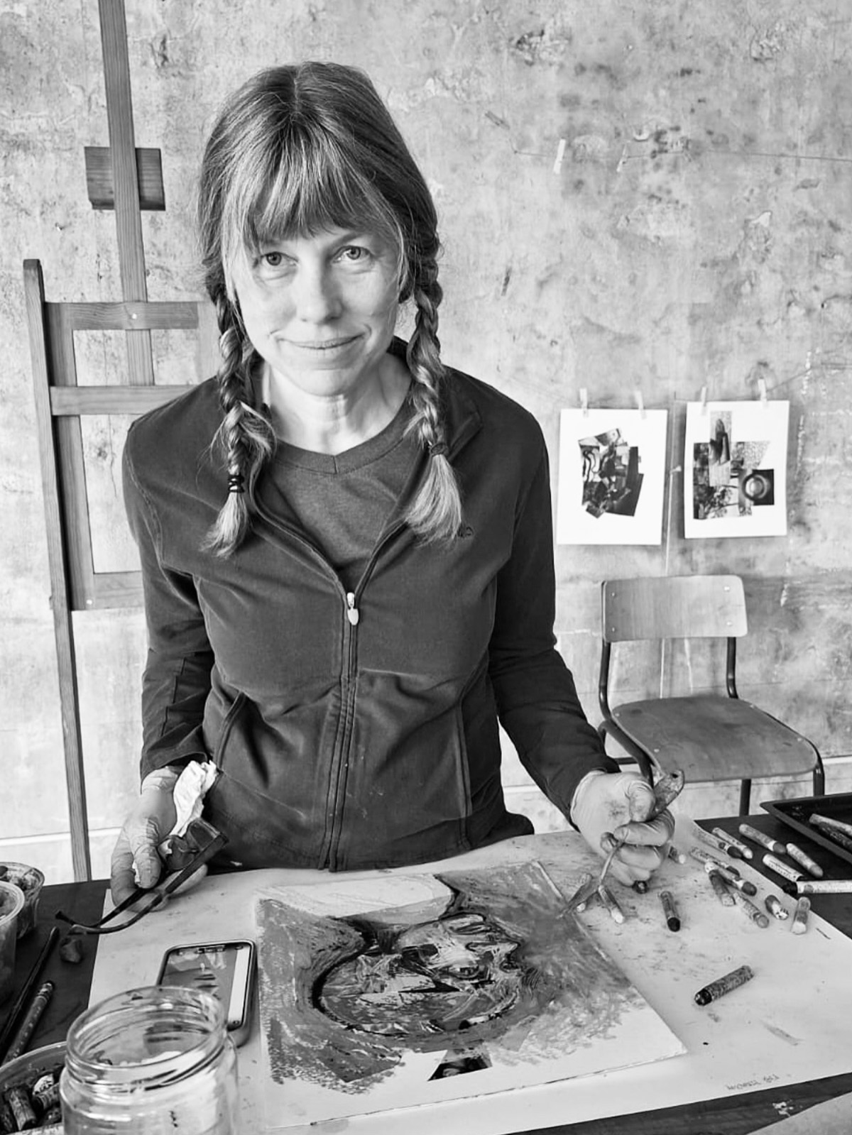
Natalie in her studio
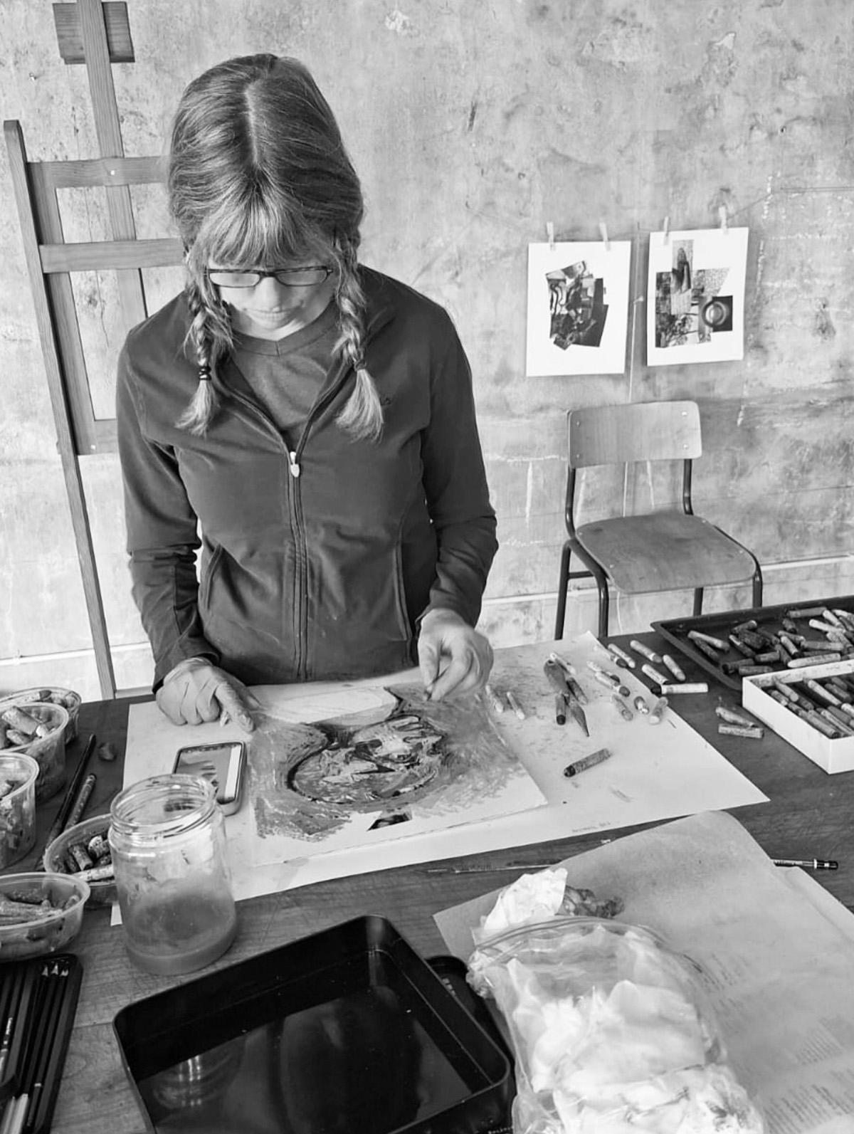
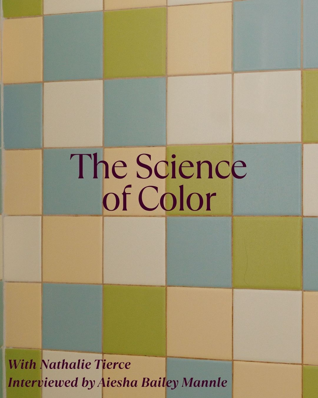
Mixing colors